
Clear Insurance Management Rebrand
Clear Insurance Management needed a brand refresh to lay a solid foundation for future marketing efforts. As the lead designer, I was responsible for developing a cohesive visual language that would modernise their brand.
The main challenge was to create an identity that didn’t feel too different to the previous design, as per the client, while trying to push the brand in a new direction.
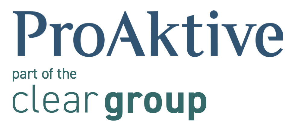
Old vs New Logo
The new logo reflects the company's commitment to reliability and trust. I removed the icon, chose a modern color palette, and kept the same typeface to maintain continuity, reinforce the company's values, and ensure a professional yet approachable look. These elements form the core of the brand's visual identity.

Font Choice

Colour Swatches
Logo Adaptation

Warm/Inviting Images
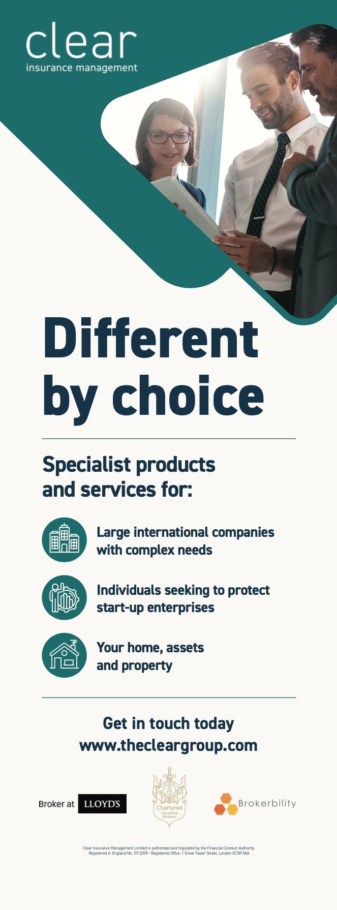
Marketing Collateral
I developed a suite of marketing materials, including flyers, banners, and business cards, to maintain consistency across all client interactions. Each piece was designed with the new brand identity in mind, ensuring a unified look that reinforced the company’s message and values.

Business Card: Front

Flyer for Sister Brand
Banner

Flyer for Sister Brand

Business Card: Back

Email Signature
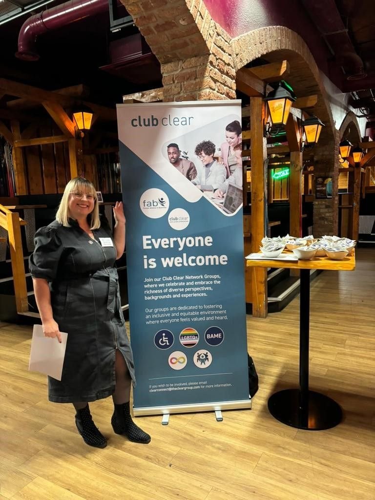
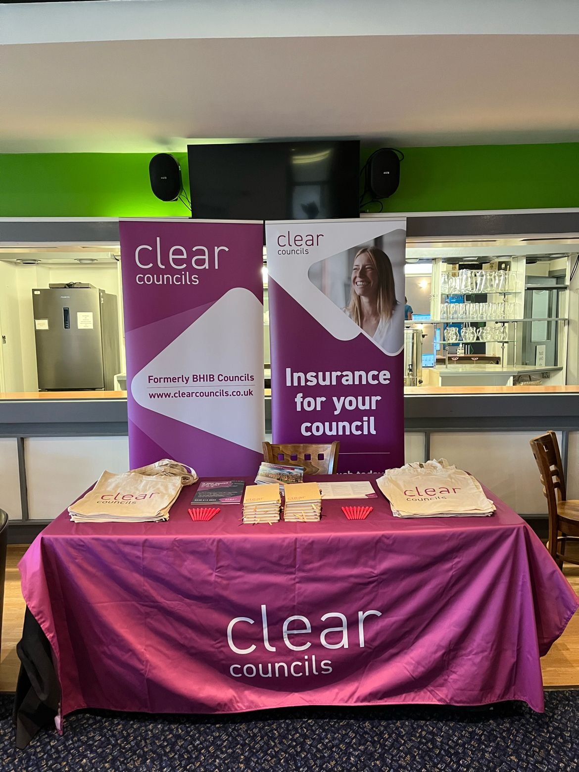
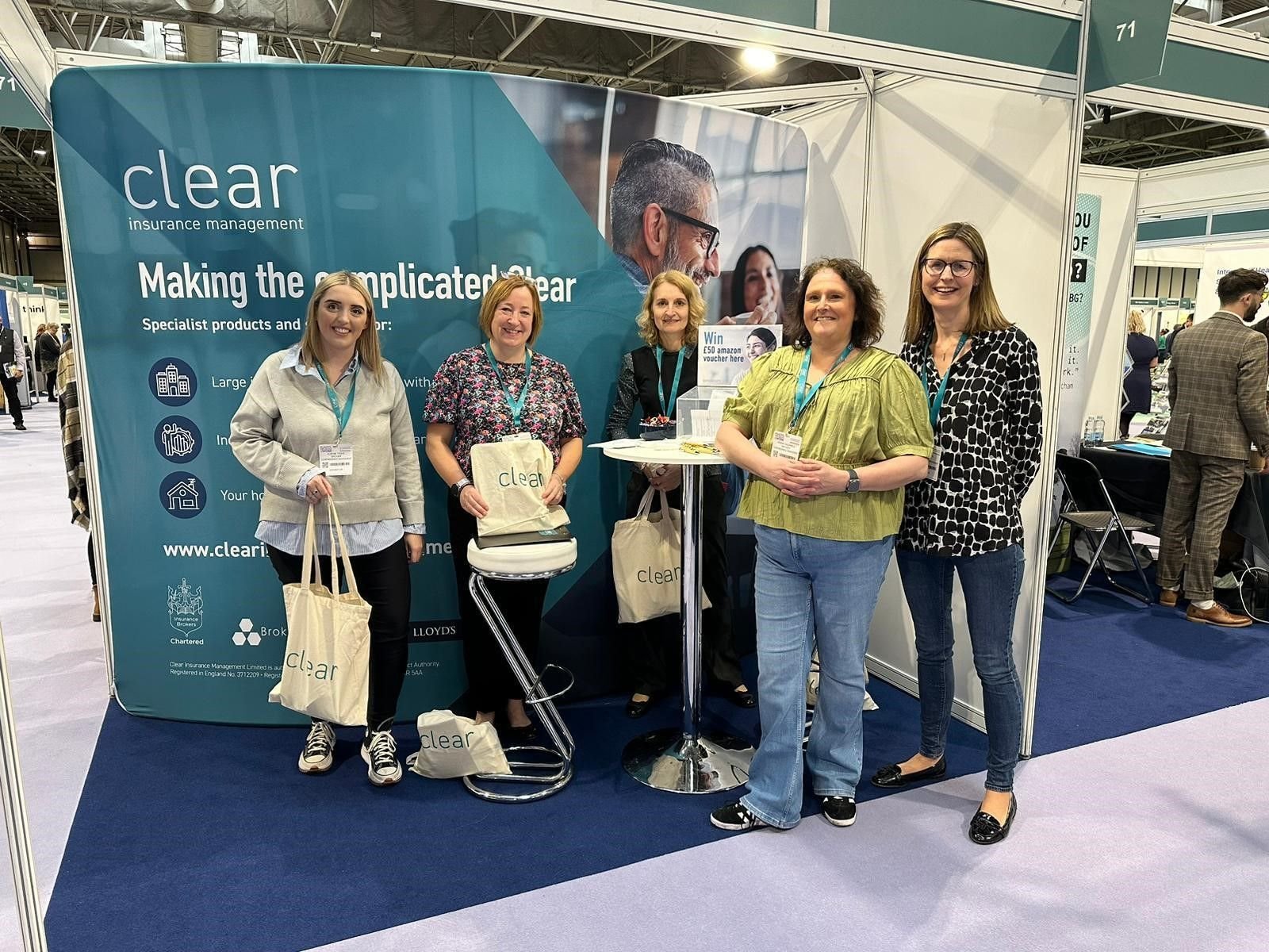
Real-World Application
Seeing the brand applied in real-world settings was a key highlight. From signage to brochures, the new identity was consistently implemented, ensuring Clear Insurance Management’s image remained strong and cohesive across all mediums.

The rebrand successfully modernised Clear Insurance Management’s image, helping to increase client engagement and align the company’s visual identity with its strategic goals. This project emphasised the importance of a well-executed brand system in building trust and recognition.